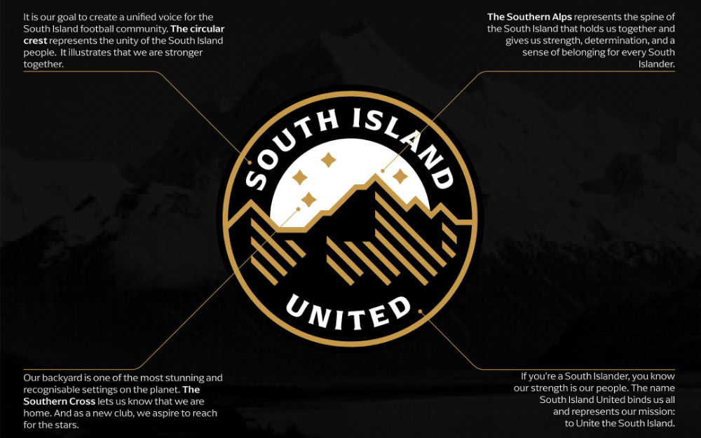
On 28 November 2025, South Island United unveiled their official club logo / crest. Here is what the club said about it:
It is our goal to create a unified voice for the South Island football community. The circular crest represents the unity of the South Island people. It illustrates that we are stronger together.
Our background is one of the most stunning and recognisable settings on the planet. The Southern Cross lets us know that we are home. And as a new club, we aspire to reach the starts.
The Southern Alps represents the spine of the South Island that holds us together and gives us strength, determination, and a sense of belonging for every South Islander.
If you’re a South Islander, you know our strength is our people. The name South Island United binds us all and represents our mission: to Unite the South Island.
South Island United was formed for the OFC Pro League which will have its inaugural season starting in January 2026. South Island United is the professional branch of Christchurch United but will maintain a distinct identity, kit, and management structure.
While the South Island United Crest / Logo has now been revealed, we are now waiting for the kit to come out. We have heard that the club will be using the colours BLACK, WHITE and GOLD with the black being a homage to the island’s coal mining heritage and the Gold to remember the brave prospectors of the 1860s gold rush in Otago and the West Coast.
